Rethinking notifications: when constant pings help and when they just distract
By Aisha Khan, July 5, 2025
Notifications were designed to keep us informed, but somewhere along the way, they started keeping us anxious. Every ping, vibration, or badge demands attention — whether it deserves it or not. Thoughtful design can restore calm to our digital lives.
Effective notifications have intent. They appear only when necessary and disappear when not. They don’t compete for focus — they support it. By prioritizing urgency, frequency, and tone, designers can help users stay connected without feeling overwhelmed.
Modern work tools have blurred the line between helpful reminders and constant interruptions. The result is alert fatigue — a state where people begin to ignore everything, even the important things. A well-crafted notification strategy reduces noise while keeping what matters visible.
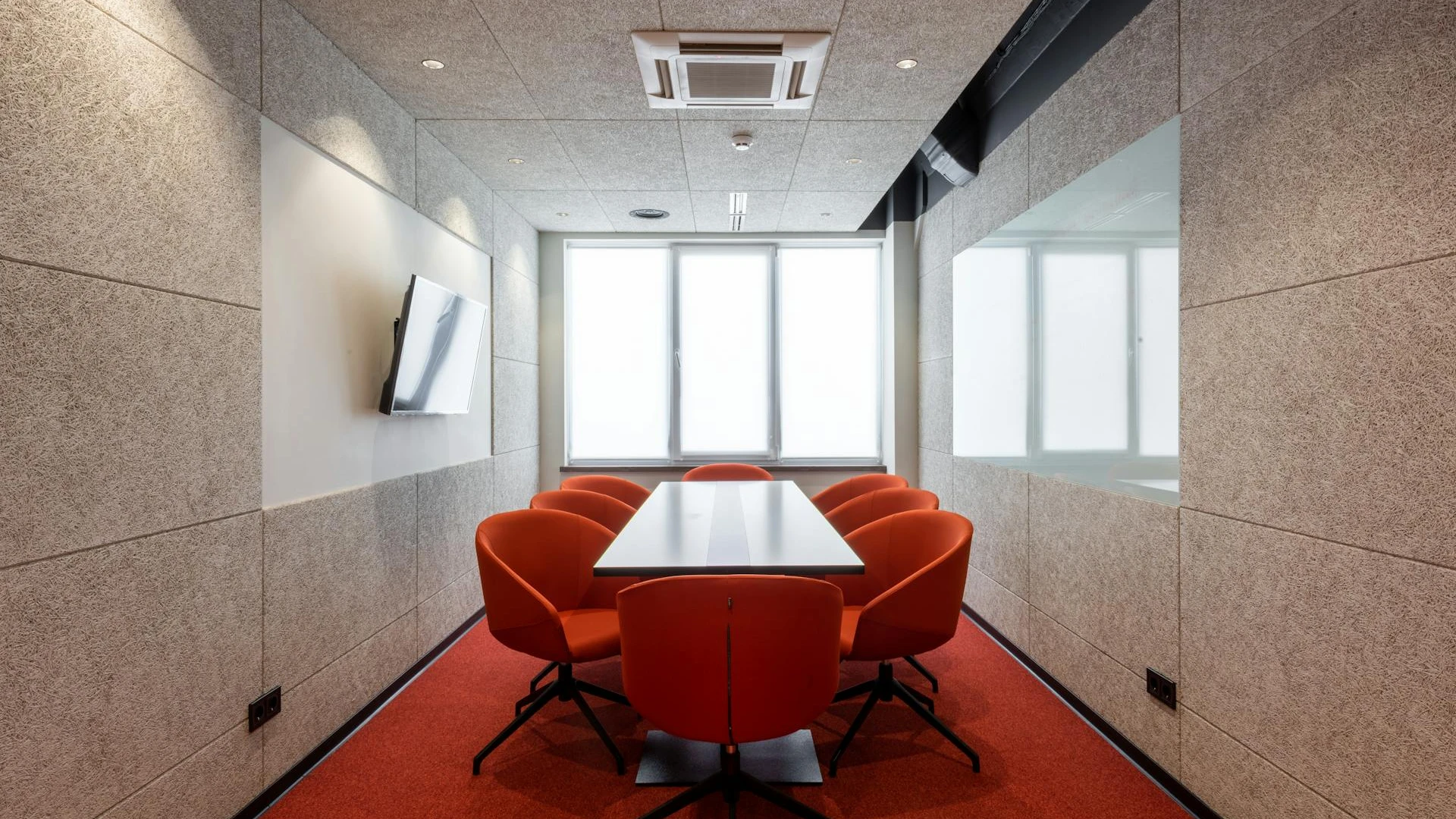
Calm, intentional notifications allowed our team to focus without feeling pressured.
Personalization is key. Users should feel in control — able to mute, group, or schedule alerts based on their needs. Visual cues and haptic feedback should reinforce meaning, not add stress. Subtle design choices, like gentle animations or neutral tones, make a big difference.
At their best, notifications are a bridge between awareness and focus. They remind us without commanding us. They keep us informed without taking over our attention. Designing them responsibly is less about UX and more about respect — for time, energy, and mental space.
Launch your next big idea today
Join creators, teams, and startups already turning their ideas into reality. Get started in minutes and see how simple launching can be when everything works together seamlessly.
Try it for free!